
Updated 8 Nov 12 to include my coloring for Lily Pratt, Suzie McBride, Doubt, and Panic.
Updates 26 Nov 13 to include Atsali and Castella - PW's colors.
Moderators: Bookworm, starkruzr, MrFireDragon, PrettyPrincess, Wapsi
Julie, about Wapsi Square wrote:Oh goodness yes. So much paranormal!
 My deviantART and YouTube.
Wow, I do my work with moose, (it's kinda big) I can only imagine what a pain in the rumpus a track-ball must be...shadowinthelight wrote:For some reason I never imagined Katherine with such dark skin but looking at Paul's illustration gallery I guess you got it correct. Maybe one day I'll get a tablet and start coloring. I love using a trackball most of the time but it does make certain things more difficult.
Your pointing device is a moose?Jabberwonky wrote:Wow, I do my work with moose, (it's kinda big) I can only imagine what a pain in the rumpus a track-ball must be...shadowinthelight wrote:For some reason I never imagined Katherine with such dark skin but looking at Paul's illustration gallery I guess you got it correct. Maybe one day I'll get a tablet and start coloring. I love using a trackball most of the time but it does make certain things more difficult.
I got some, inquiring comments, when I did a color of the pin-up of Kath and Oscar and defended with the fact that it was taken from Paul's color work.
I'll have to organize my color charts and compare with Atomic's...
It's like a mouse, but bigger....Dave11 wrote:Your pointing device is a moose?Jabberwonky wrote:Wow, I do my work with moose, (it's kinda big) I can only imagine what a pain in the rumpus a track-ball must be...shadowinthelight wrote:For some reason I never imagined Katherine with such dark skin but looking at Paul's illustration gallery I guess you got it correct. Maybe one day I'll get a tablet and start coloring. I love using a trackball most of the time but it does make certain things more difficult.
I got some, inquiring comments, when I did a color of the pin-up of Kath and Oscar and defended with the fact that it was taken from Paul's color work.
I'll have to organize my color charts and compare with Atomic's...
Hold the antlers just right, and you get wonderful, expressive detail quite easily. Highly recommended, provided you have the room on your desk. And a tranquilizer gun.Dave11 wrote:Your pointing device is a moose?
I don't tranquilize 'em, just challenge them to a wrasslin' match. Watch out for sore losers, though. Nothin' worse than a sullen moose draped across your desk.Atomic wrote:Hold the antlers just right, and you get wonderful, expressive detail quite easily. Highly recommended, provided you have the room on your desk. And a tranquilizer gun.Dave11 wrote:Your pointing device is a moose?
Meanwhile, there's also this:
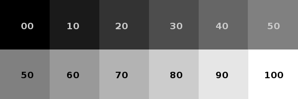
When I made Meet the Wapsis, my display turned out to be much too dark. I didn't realize it at the time, but my grays below 30% blended together. This made reading some gray on black websites very difficult to read. If you want to really challenge your display, sites like this one would be a good start.
For those wanting to fiddle about with computer drawing, using FREE software, starting with my Guide to Basic GIMP stuff can get you started. There's also Inkscape and MyPaint as well, depending your level of fiddling comfort.
Moving up a step, here are some Free sites for Textures, Color palettes, background patterns, and a bunch of fonts.
Lastly, for those working toward realism, it seems skin is made from four tones: Rose, Gold, Olive, and Plum. Katherine is Olive/Gold, Monica is Rose/Olive, Shelly Olive/Gold, Jin Gold/Olive. Brandi is Gold/Plum. Tina and Alan are Rose/Gold. You get the idea. Once you get to looking past the generalities, you get to see a whole lot more.
So - how many colors can you see in a leaf? Ok - now go draw it. Lather, rinse, repeat!

If you are on PC, I think Paint.net is the right choice. Does a little less than PS or GIMP but what it does it does very well, is easy to use and you cannot beat the free price. GIMP has a convoluted interface.Jabberwonky wrote: I recommend G.I.M.P. for all those interested in Photoshop. It's basically a free ware version of PS. I learned a lot of chops on it before using PS. Actually I was trying to use PS and then went over to G.I.M.P. and then after a certain comfort factor, went back to PS. There's some things each one does better than the other.
(Text effects are easier in PS, IMHO, than G.I.M.P. But I can 'Pentool' a curve better in Gimp than PS.)
Can't wait to go look at the sites you've put up. I had several places to get Gimp tutorials, but without Web on my personal computer, I'd have to search around to find them again. I'll see what I can do.
Thanks for sharing, Atomic.


Julie, about Wapsi Square wrote:Oh goodness yes. So much paranormal!
My deviantART and YouTube.

I have Paint.net and PSP 7. I use both of them (and the GIMP occasionally) - and Serif's PagePlus X5 DTP, as well*.alj_ws wrote:If you are on PC, I think Paint.net is the right choice. Does a little less than PS or GIMP but what it does it does very well, is easy to use and you cannot beat the free price. GIMP has a convoluted interface.
I think Fairportfan has it nailed here.Dave wrote:Is there any information on record about the color(s) of the various characters' eye-lights, face-lights, and facial glyphs?
Today's shot of Monica in full rage-filled glyph aspect just screams to be illuminated properly!
Yup... that's clearly the correct canonical reference.Atomic wrote:I think Fairportfan has it nailed here.Dave wrote:Is there any information on record about the color(s) of the various characters' eye-lights, face-lights, and facial glyphs?
Today's shot of Monica in full rage-filled glyph aspect just screams to be illuminated properly!