Re: Photo Album
Posted: Mon Nov 07, 2016 12:38 pm
Excellent! Excellent! 
A place to discuss the world of Wapsi Square
http://forum.wapsisquare.com/
Didn't actually say it WAS - just that it looked like it.AmriloJim wrote:I don't think so, AFF.
1) CSG output is usually dead square to the horizon; this one's tilted slightly.
2) CSG characters are a typeface; note the variance between the Ts in "kitten".
Their logo is laughing at you!Just Old Al wrote:
One for Dave - seen Saturday morning in Hudson, NH.
Boy, i'm glad you saw it that way... sorry to go there, but to me it looks like a cat's butt up close...lake_wrangler wrote:Their logo is laughing at you!Just Old Al wrote: One for Dave - seen Saturday morning in Hudson, NH.
(Or is it laughing at its own pun?)
Nope. If I'm lyin' 'm dyin'. That is the honest-to-gods truth. The only photo manipulation that got was cropping and reduction in size to hit the limits for the site.AnotherFairportfan wrote:That looks amazingly like Church Sign Generator output...
Oh, i wasn't doubting - i meant it reminded me of some of the better CSG bits i've seen. However, as AmrilloJim points out, the letters aren't uniform, and, as i said, it doesn't have the URL on it.Just Old Al wrote:Nope. If I'm lyin' 'm dyin'. That is the honest-to-gods truth. The only photo manipulation that got was cropping and reduction in size to hit the limits for the site.AnotherFairportfan wrote:That looks amazingly like Church Sign Generator output...
Al
Nice! I agree about the second one.lake_wrangler wrote:I was wondering who was going to take those photos and when they would get posted, what with last Sunday being the closest the moon has been to the earth in 70+ years, or somesuch...
I can't decide which photo I like best... I like the darker portion at the top of the second one, which happens to put the craters in contrast.
Both pics were fiddled with to bring out contrast and shading, thus the second being a little darker. Otherwise, the originals are identical in look.Typeminer wrote:Nice! I agree about the second one.lake_wrangler wrote:I was wondering who was going to take those photos and when they would get posted, what with last Sunday being the closest the moon has been to the earth in 70+ years, or somesuch...
I can't decide which photo I like best... I like the darker portion at the top of the second one, which happens to put the craters in contrast.
That's usually my luck.TazManiac wrote:Great work, and thank you.
I was walking up and down the country road up here, taking my time, and just as I went to get the good optics out...
Clouds rolled in... I am sad...
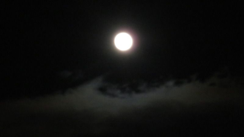
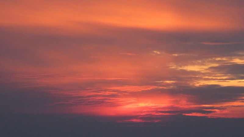
I like the clouds around the moon, can almost hear the weirdwolves howling in the distance! And great color in the sunset.Catawampus wrote:The smoke was too thick to really get a clear view of the moon, so this is the best I was able to get. On the plus side, the smoke has provided some colourful sunsets.
Yes! There it is!AmriloJim wrote:Let's try this again... it worked fine in rehearsal (preview).
I've had my Olympus SP-500UZ for ten years and this is the first time I've played with aperture, ISO and shutter.
f8, ISO400 @ 1/400:
The camera didn't pick up the reds that well. I might try fiddling around with the settings, see if there's some sort of colour balance adjustment function. Or I'll accidentally activate the reactor scram function. There are some weird menus on that camera. . .Hansontoons wrote:And great color in the sunset.